Product Comparison Sheet
Design Objective
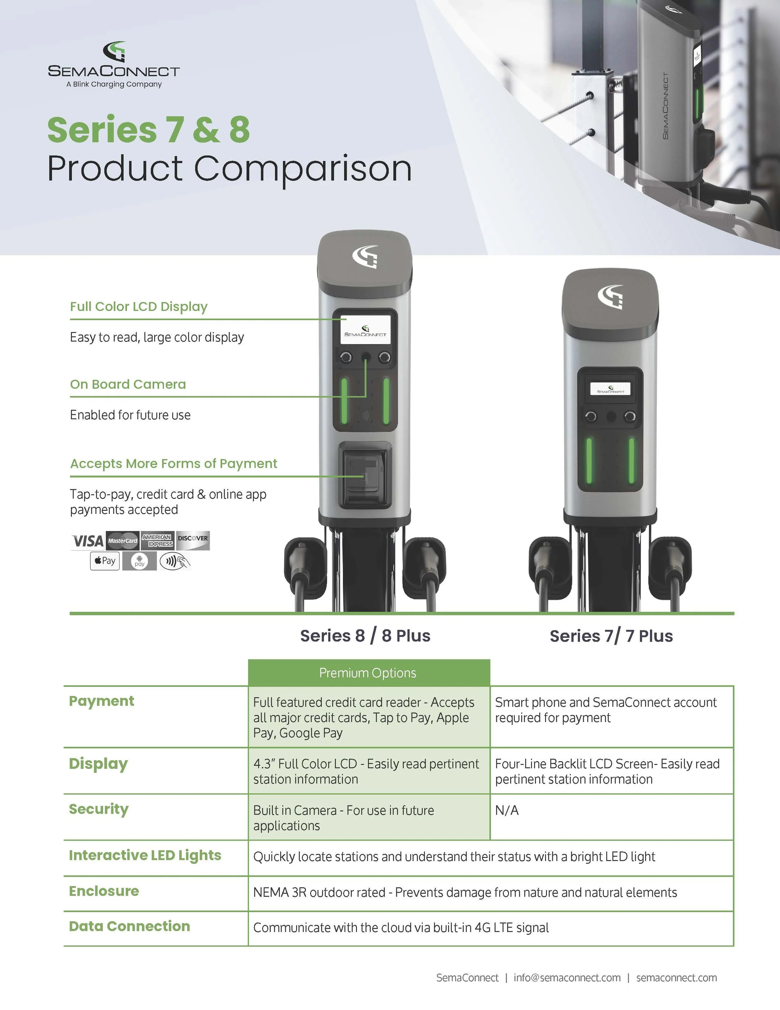
To help customers choose the best charger for their needs, I was tasked with creating a comparison sheet. This resource would provide clarity, reassure customers in their decision-making, and reduce purchasing friction. Additionally, it provided an excellent opportunity to highlight and entice customers with the premium features of the Series 8.
Process
For the composition, my objective was to highlight the two chargers, ensuring they captured attention and conveyed their value effectively. I placed them prominently in the center of the canvas against a clean, stark white background to make them the focal point.
To create depth and visual interest, I strategically overlapped the Series 8 charger rendering over the title block. This not only draws the eye but also sets the Series 8 apart. Using modern, sleek lines, I pointed out the premium features exclusive to the Series 8, clearly differentiating it from the Series 7.
The accompanying chart below mirrors these sleek lines and highlights the Series 8's premium options, reinforcing its superior features. This design strategy effectively underscores the advanced capabilities of the Series 8, persuading potential buyers of its enhanced value.
By emphasizing the unique benefits and premium features of the Series 8, this design successfully guides customers toward purchasing the higher-end model, leveraging visual hierarchy and design psychology to drive sales.


